 Coming home from the pub last night I was a little wobbly and did a double-take when I saw the latest issue of eye on the seat next to me.
I used to enjoy eye. Then they went and wrecked it by cutting loose their good writers and implementing a bloody awful redesign.
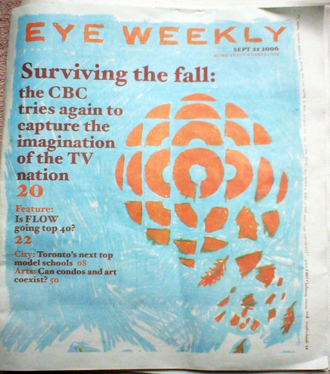
The article is not bad, but it’s the graphic on the cover that’s the real curiosity. I consider myself a connoisseur of defaced CBC logos. Some of them are quite clever. Some of them are crudely clever. This one gets a failing grade. Not only are there too many pieces, but it’s 90 degrees off. The thing in the middle is supposed to be a “C.” It stands for “Canada,” you see.
 One interesting phenomenon the article points out is the popularity of the retro CBC logo t-shirt among hipsters. They seem to be everywhere, and Flickr is full of pictures of good-looking people wearing them.
Rightly so. It’s an op-art piece of genius, made by Burton Kramer in the 70s. Kramer’s firm went on to design the signage in the TBC, and now the Toronto street signs. I guess he ran out of good ideas.
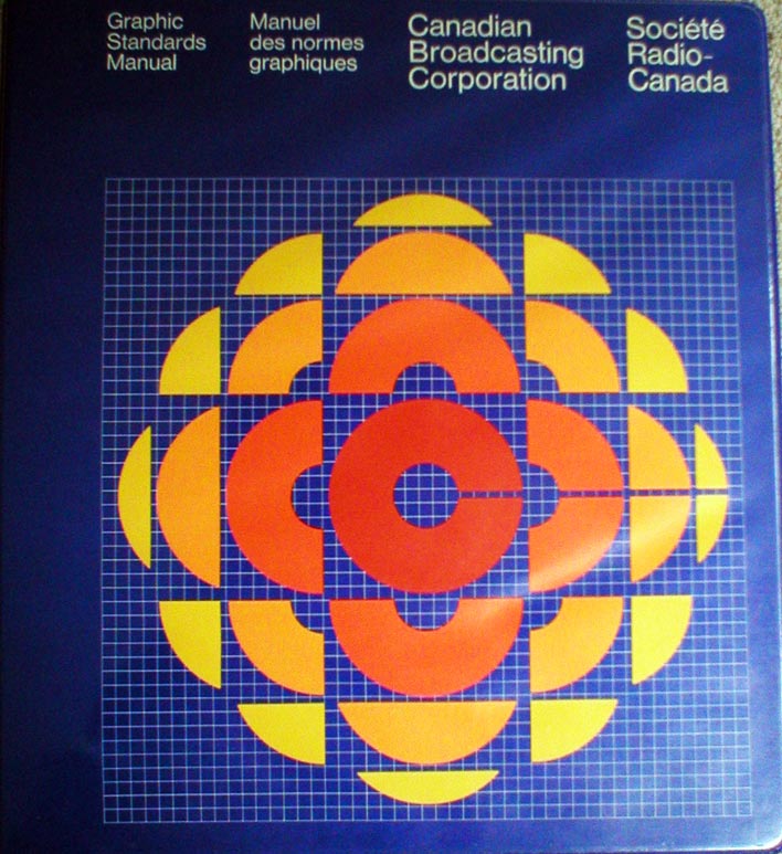 On a trip to Ottawa Head Office years ago I stole an old “Graphic Standards Manual” from the office of some functionary when he went to take a Fournier. It’s an interesting document, outlining the “Corporate Identification System” for the CBC in the 70s. We call this “branding” now. Did you know that they invented the shade of blue used for the background? They did. It’s called “CBC Blue,” and can make it by mixing “Reflex Blue with 1/2 part Black.”
The book is full of pictures and diagrams of envelopes, memos, microphones, signage, station id’s, and even sheet music. But the highlight, surely, is the plan for the CBCmobile.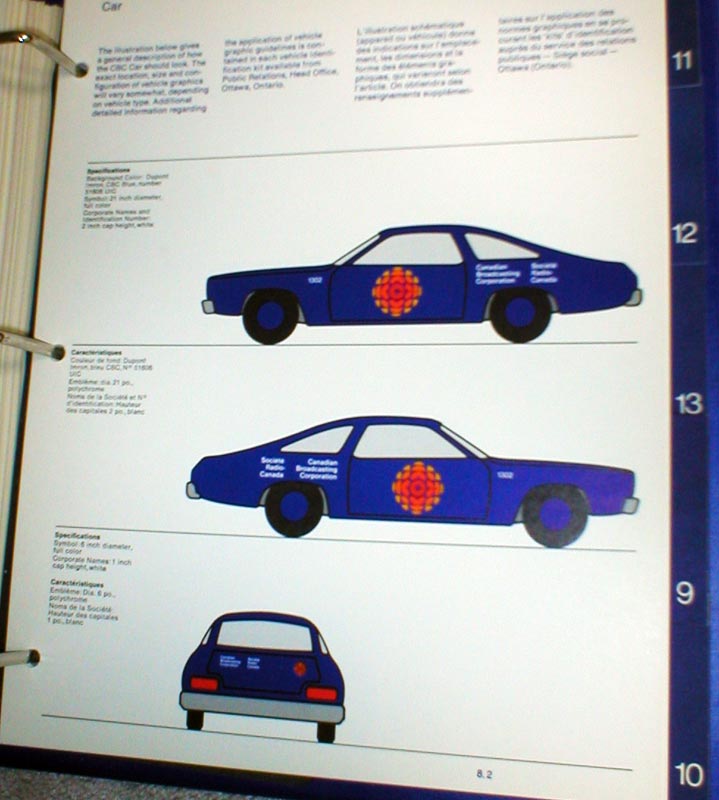
Damn. Now that’s a sweet ride.
11 Comments
Anybody who is not a fan of this logo is a design idiot.
PS For what it’s worth, I always kinda liked the butterfly – better than the NBC peacock.
I recall CBC Regina had a few CBCmobiles. One time I had to drive from Regina to Saskatoon in a bluish-purple Dodge Omni (or was it a Plymouth Horizon?) with the massive flaming orange/yellow/red pizza on the side. You should have seen the looks I got at the gas station.
I also remember employees getting a usage bible for the “gem” was introduced in the early 90s. It talked about how and when you could use the logo (then called the “molecule” in red or black or white, as well as the typeface/leading/kerning for any and all text around the logo. Fascinating reading for the graphic designers out there. Of course, within about fifteen minutes of the molecule making its appearance, CBC designers across the country started immediately flouting the bible at every opportunity. Up the revolution!
Hey! That’s me in the t-shirt!
I’ll take it as a compliment…
Could you post scans of every single page of that graphic standards manual somewhere? I’m intrigued by what it says.
The two logos that to me meant PURE Canada,the CBC abstract C and the multi colored CKLW 9 (and I was weened on CBC all the way here in Michigan)
I cant stand that pepperoni logo..now if they added the CBC letters inside the little circle
it would be ok,a little ultra retro look.
Aside from myself, I’ve no idea yet.
But then, I’ve been interested in design stuff like this since high school.
*looks around the room for other interested persons…*
Maybe I will scan some pages of it Dwight. Do you think anyone would be interested?
Heh. “CBC Blue”…I am now wondering if I could nail down the Pantone or hex code number for that on CorelDraw.
Good on you for salvaging that document, Ouimet. Hoping to see the rest of it someday!
Yes, you’re right. I changed it. Thanks Joe.
The cover logo is rotated 90°, shurely?!
Also, call Blogger: Your italic (not emphasis) markup is fux0red.