Why isn’t the CBC.ca homepage very good?
I mean, it just doesn’t “work.”
If you’ve ever felt this, you aren’t alone. Truth be told, focus groups have also ripped it to shreds. Alice isn’t too happy with it either.
 And when the site crapped out not long ago and a makeshift page was put in it’s place, people here and elsewhere said they preferred it to the real page.
Then you had the astonishing post on insidethecbc where Blake Crosby told you how to recreate the look, scraping away all the barnacles and eviscerating the revenue stream, removing the ads, promos, news ticker, in-depth, giving you a straight shot of news.
It was a cry for help disguised as a how-to.
Now, to be fair, this page has a lot of jobs. Some people come here for news. Some come to find radio feeds. Some come for weather. Some, God bless ’em, come for TV schedules. And don’t forget that the Kids’ stuff is more popular than anything else on the site.
In the hands of a skilled artist, serving these needs is not insurmountable, and I truly believe we’ve some of the best designers in the world working here. But they are not always allowed to design. They are hamstrung by politics and just as embarrassed by the page as anyone else.
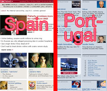 The CBC.ca home page is dominated by an political line drawn straight down the middle that sets the boundaries between “news” and “everything else.” There may be better ways to design the page, but this is the one that satisfies the most dictators.
In fact, the nerds at CBC.ca have taken to calling the 2 sides of the page the Spanish side and the Portuguese side, in reference to the Treaty of Tordesillas, in which Spain and Portugal arbitrarily divvied up the world.
 Of course, this is a nice, easy solution for kings and executives, but it’s a bitch for everyone else.
In fact, on some days the page seems to spin out of control, with seemingly no one in charge and warring factions wrestling with each other, threatening to tear the page asunder.
 As I write this, Andrew Craig is on there twice.
For some real hilarity, keep your eye on the “Latest Video” section with the garish WATCH NOW >> button. It’s being pulled directly from the Newsworld feed, so you never know what you’re going to get. Sometimes an ad. More often, a talking head with her eyes closed.
 Now that’s dynamic content!
But in the rush towards progress, “fuelled by a combination of adrenaline and Gravol,” conventional wisdom tells us that it has to be faster, and louder, and more lurid or people won’t see it.
Just about the only place on CBC.ca where you can get a bit of peace these days is the media page, with its calm, reassuring lines:

So design, for God’s sake! Design!
Design like hell!

17 Comments
Wow! What a bunch of whiners.
How’d you like to be a mere taxpayer paying for this shite? You guys are indeed in the ivory tower and haven’t a clue what it’s like to be out there working to fund the CBC’s socialist propaganda.
“On a map with a typical projection, Portugal is to the left of Spain, not vice-versa.”
Joe,
Your lameness continues to amaze.
“On a map with a typical projection, Portugal is to the left of Spain, not vice-versa.”
RTFA
Be thankful you’re not this page – City TV Toronto
It’s dismal enough that most of us who still work here don’t read our own site for content… we just visit the BBC.
of many sad threads i’ve read on teamakers, this one is surely the most tragic.
is it really this dismal?
Well, it’s about time someone just said it — the designers of CBC.ca are not permitted to design. Management simply won’™t permit it. The designers have tried, God knows, they’™ve tried. Do you know what happens when you’™re work is continually undermined and criticized? Or when your employer doesn’™t trust you enough to do the job that you are eminently qualified to do? You leave. Ask anyone who works in that department. Better yet, ask HR. [BTW: this doesn’™t just apply to the designers of CBC.ca.]
As a former Project Manager at CBC.ca, and one of the first people to “join” New Media (before it was coined such), I’m intimately aware of how pigeon-holed the talented designers of CBC.ca were and continue to be. Without naming names, I will say that most managers (and up) of the past few years believe that they themselves are not only qualified designers but interface engineers, journalists, project managers, developers, and gurus of everything online. If that were true, CBC.ca would be an indomitable force in the world of online media, and no matter what the “powers that be” at CBC.ca spew, that simply is not the case.
I was proud to work with the talented designers at CBC.ca (before they all left) but don’™t blame them for the poor design of the site. They haven’™t had a chance to design it in years.
On a map with a typical projection, Portugal is to the left of Spain, not vice-versa. (Map projections are a tricky issue, of course, and it is possible to situate south at the top of a map, in which your rendering would make sense.)
“Most web designers think because they can use Photoshop and create pretty pictures they can design a web site. Nothing could be farther from the truth.”
Uh, looked under the hood lately, Neilsen?
.CA pages post redesign move towards a higher level of usability than ever before.
It isn’t the developers / designer’s fault that the cleanup job done with the redesign gets constantly overstuffed with ads, categories and other ballast.
See, New Media BILLS Radio, TV, and News for much of what you see on the site. Half the time, requirements from producers and higher-ups override simple, clean designs.
We’re talking about a crew that uses the web the way their counterparts use recording gear or generate graphics on an Avid. It sucks to think that that comes as a surprise.
Most of the photoshop dudes and dudettes’ work you speak of comes in the form of ‘offshore’ sites, developed by friends of primadonnae from the older media lines that get a pass on processes like CBC.ca go-live.
“CBC.ca, invest in some designers trained in ergonomics, the site and its users will love you for it.”
Have you read the article? Do you understand the politics involved in this site? The Design department at CBC.ca is rapidly disolving(1 designer remains). Just recently, a 7 year veteran, a “lifer” left his comfortable job as one of the CBC.ca web designers. Why? I would rather not speak for him, but considering the crap that the design department has to go through, the throttling of creativity, the absolute disregard for even the basics by upper management… its no wonder. The designers DESPERATLY want better.
allan, you don’t like the internet do you?
some of us use the net as our most important source for media: text, audio, and video. For myself, I never watch TV (except for the odd CSI Miami, God save me); I listen to tons of audio – mostly podcasts, tho radio gets a fair bit of ear time too; and I watch the odd Youtube video.
but for me, as for most people I know, my overwhelming source of information is the net.
so if CBC wishes to be relevant to me, and others like me, then it must have a useful presence on the net, including, in my opinion, news.
if CBC does not wish to relevant to people like me, then it will I think (perhaps I am wrong) wither and die, because the youngsters are even more tied to their computers and pdas and fancy phones and newfangled gizmos than I am. and that, whether we like it or not, is reality, and the future for everyone in the media business, including the CBC.
and the sooner CBC figures that out, and lets their tech crew build a site that is useable (currently it is a bit of a mess, with a horrendous search function), the more likely they are to appeal to a new audience, which, I think, is what they’re looking for.
News — not kids — gets the most traffic.
What strikes me is that they have tried to cram everything..everything onto one page: news, television, radio, kids, health, A & E, Podcasts, independent production guides, shopping, ……… even the Zed site, the archives and the email lists which don’t really work are there if you look hard enough.
In the short term, it seems to me, the best way to go about it would be to identify different audiences and create sites with things you’d expect those audiences to be interested in so you have multiple “front pages” and people can bookmark their CBC page.
In the long term the pages should be customizable, like Yahoo or Google so that you have your own ‘my CBC’ page and can then (using RSS etc) customize your CBC page – with local news, weather, the programs you want to keep an eye on etc. Expensive? Yes but definitely worth it.
The site I most frequently visit is that of the New York Times. While it is better designed than cbc.ca, it is no model. The NYT site is attractive because it is packed with content; news and other stuff from the paper, and abundant purpose built material, including editorial on video, interactives and audio slide shows. I go to the site at least twice a day (despite finding the paper’s politics odious). Fix the design of cbc.ca, by all means, but consider please, the primary problem haunting every service of the CBC, paucity of content.
Since they are going to copy the BBC anyway, copy the “crisis” style the BBC uses when there is excessive bandwidth use. That was first employed in the Sept 11 aftermath when the servers were crashing.
Ban all browsers except Lynx?
See http://www.toools.de as a minimal style.
Design is a joyful art, but content is foremost.
Why even bother with the news?
I go to CBC.CA for information about it’s broadcasts, split down the middle between radio and television. Simple.
Let them branch off for their respective audiences instead of throwing everything on Page One as if pointing people to a haystack.
If I want news, it’s the local paper,CNN, NYTimes, Drudge and Google.
What more do I need?
CBC News on this site offers nothing new or different. Lose it.
Also, what purpose is served by cluttering up the page with:
-Test your knowledge of the Beatles post-breakup
– Famous poisonings
– views of a freelance writer
And look at the very top of the page:
CBC.CA – Canada’s News, Money, Sports, Health, Technology & Science, Consumer Life, Arts, and Kids Information Source
any more and they’ll run out of space.
Someone seems to have lost perspective on the point of a CBC website.
The media page employs horrid ergonomics, actually the whole site is an ergonomic nightmare. There are really two parts to any “design” and that is Ergonomics and Aesthetics. You’re talking a lot about Aesthetics, it’s the Ergonomics that count in user experience. Good Ergonomics are not noticed, they result in a comfortable user experience. Poor ergonomics result in a frustrating navigation experience and users not getting what they want fairly early on in their visit.
Too much emphasis is put on Aesthetics. Form follows fuction, not the other way around. I guarrantee you most “Designers” are not trained in ergonomics. The best web designers I know of are former Industrial Designers who have studied interface design (as an example; cars dashboards).
Most web designers think because they can use Photoshop and create pretty pictures they can design a web site. Nothing could be farther from the truth.
CBC.ca, invest in some designers trained in ergonomics, the site and its users will love you for it.