Did you know that the brainiacs behind the signs in the TBC were given the go-ahead to do the signage for the whole city of Toronto? They’re finished already, and will be presenting the fruits of their labours around the city this month.
Now, I don’t want to blame the fine people at Kramer Design for the fact that I’ve been lost for most of my professional life. It’s a confusingly laid-out building. But I have a quick question for the Sign Makers:
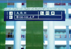 Here’s a picture from their website.
Forget the fact that you go 2 different ways to find B, which eventually meet up.
But which way to D?
Sept 20 9:20 am addendum
Accessibility expert and Tea Makers fifth Beatle Joe Clark has posted mockups of the new Toronto street signs.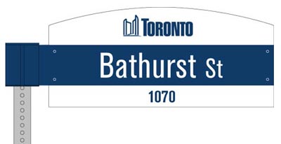
It’s like you never left the TBC.
~O
10 Comments
I seen those new street signs today. They are located at Yonge and College. Although they are easy to see with all the other clutter on our streets there is something that has bothered me.
Other then the fact that Yonge and College is part of the “Downtown Yonge BIA*” Why is it that the new signs I have seen do not have the BIA logo on the top blade of the sign. It was stated on the Toronto city webpage that “The upper ’œblade’ provides an area on which to brand the identification of Business Improvement Areas, neighbourhoods and communities.”**
So I am curious to know why these signs are done in the standard colours rather then the proper BIA logos. It is bad enough that those “Downtown Yonge” signs are brand new and we are replacing them, but why aren’t we (the city of Toronto) doing it properly?
It clearly shows on the Toronto webpage examples “BIA Branding***” and it specifically shows on the webpage what a downtown Yonge BIA sign would look like.
Please feel free to send this out to anyone who can answer these questions, or am I just missing something?
*http://www.toronto.ca/bia/pdf/downtownyonge.pdf
**http://www.toronto.ca/transportation/street_name_signs/index.htm
***http://www.toronto.ca/transportation/street_name_signs/pdf/bia_personalization.pdf
New street sign page–
http://www.toronto.ca/transportation/street_name_signs/index.htm
Well, the blue and white have been Toronto colours since almost forever in my mind. Blame the Leafs for that. I understand the desire to get the civic wordmark in there, too.
The font choice, though? The critique is spot on, although as a traditionalist, I’d go for one of the USDoT-classic variants: Interstate from the Font Bureau, Expressway from Typodermic or Highway Gothic from Page Studio Graphics.
I would also modify the color scheme to fit specific neighbourhoods, as already established in Toronto street signage practice to date. Your kilometrage will vary.
*gag* on those new signs. apparently this firm can only afford one designer/font/style ethic…
I know a producer who stole a can of that ultraviolet spray stuff once… when the right opportunity arose, he was going to drive it into someone’s office, or off the atrium…
Even the robots get stuck occasionally, when they venture off the ultraviolet brick road.
we should ask the mail robots.. they seem to know their way around the place.
The title reads like compartment addresses on your average Trek Classic Federation Starship! Maybe CBC should hire Mike Okuda for a redesign?
o_0
Anyone remember when the TBC used to have electronic wayfinding machines by the elevators? You’d punch in the name of the person you were looking for using a touchscreen, and it’d point you in the right direction. But then they stopped updating the directory, and ripped out the machines.
Of course, that was back in the day when interviewees and terrorists were allowed to find their own way around the building.
Oh, you can’t get to D from there.
I am surprised that nobody at Kramer Design ever thought to post maps to explain how the building quadrants are laid out. I only discovered the geographical meaning of the quadrants after I came across an old “welcome to the TBC” booklet, issued to staff when we moved from the Jarvis St. facility.