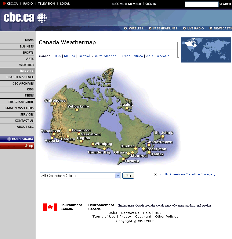
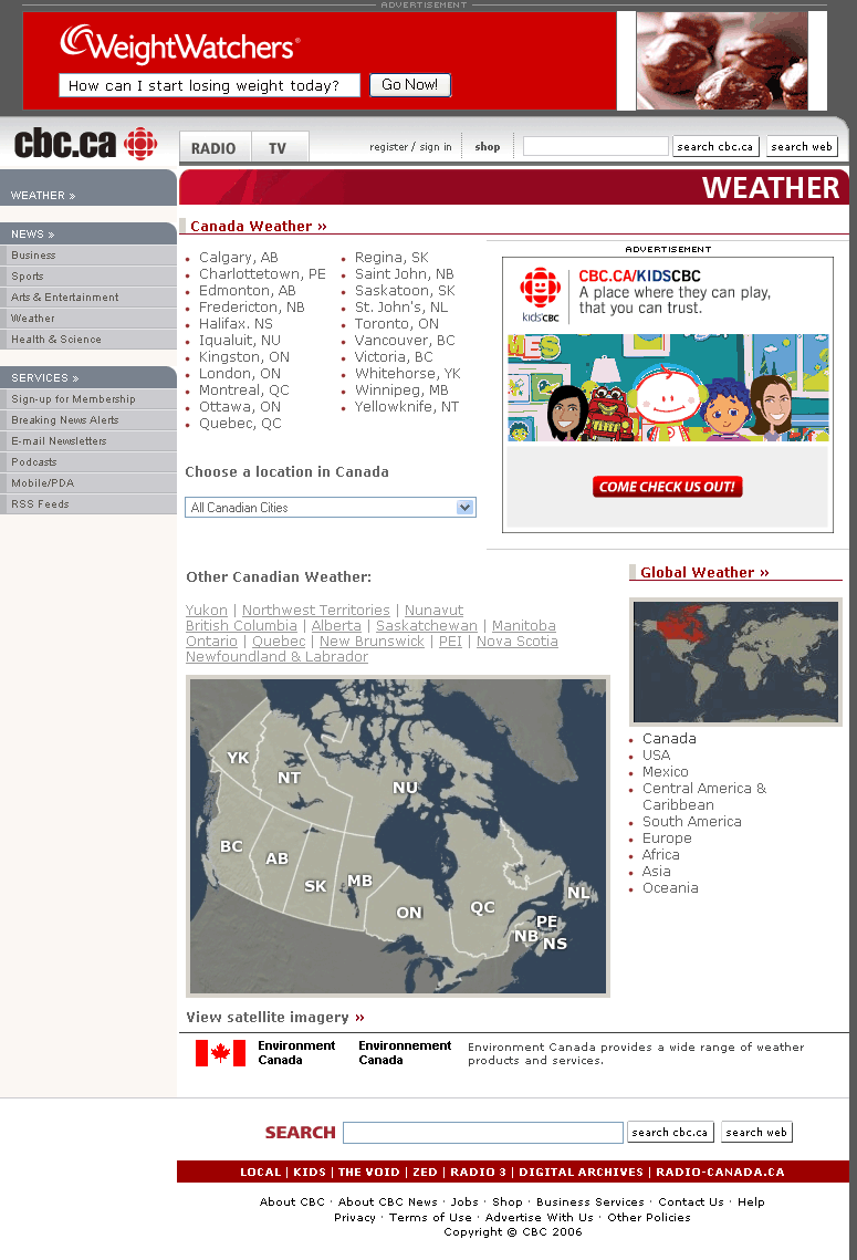
Not sure when this started, but it begins with the weather page. Looks like more room was made for ads, the colour of the words lightened, and the links camouflaged. Over the next few months, the whole site will look like this.
Say good-bye to Mr. Blocky Blue, and hello to Ms. Curvy Red.

9 Comments
I know the CBC webheads are reading this. I know because someone from New Media added me to their list of links.
So what do you say to these people, “cbcnm”?
It’s a blatant misuse of taxpayer money – the person who made the decision to put in these intrusive ads should be Hanged, Drawn and Quartered – or at least FIRED.
Without the ads, at least I can tolerate the 100 errors found by validator.w3.org.
What makes it even more annoying – even if the page has more ads, it’s using *LESS* of my screen – before the change, about 28% on the right is unused. Now almost HALF of my browser on the right side is blank.
Looks like it’s designed for 640×480 screens. Somebody should wake up. It’s 2006 and most people have 15+ inch monitors with 800×600 resolution or more.
More ads, less space – no wonder everything looks cramped.
It’s zoomed past news.com in the ugliness department and it looks like a downward spiral.
Layouts of the news page at SRC
show two advert spots.
See: http://www.radio-canada.ca/nouvelles/
At least the blocks are labelled “publicite” so we don’t confuse them with real stories.
But also the ads offer prizes, which is quite common on the SRC website in general with contest and prizes galore in several graphic blocks on each page.
Toronto, look to Montreal for your future.
Is it true the people who made this won a CBC Award of Excellence last week?
Also last week regional links
got broken when they went, for example, from http://www.bc.cbc.ca to
http://www.cbc.ca/bc
And there were no pass-forwards with a text warning of the change.
Give the job to a blind school with 28.8 modems for coding. They would do a better job and make it better for the rest of us.
How many faults by the
http://validator.w3.org/
so far?
And Bobby?
[ Now at http://webxact.watchfire.com/ ]
I’m quite disappointed at how unoriginal it is. The html may be wrong – I wouldn’t know – but the design itself is uninspired and boring.
It’s too bad, because a redesign gives them a chance to start over and make something really special. Thisone looks like it was designed by committee.
I wish those ad banners would make like dinosaurs.
94 mistakes!
Mayeb its not finished?
Then why are they still using tables for layout and invalid HTML?