Preliminary critiques calling Newsworld’s new look “CNN-ish” were only partly right.
 To be sure, there are a lot of similarities there. For the CBC, there are now more things on the screen, and more things moving on the screen. The differences, it seems, are in the details.
Gone are the rounded corners, fades, and purple and gold of yore:
 The controversial news crawl is here to stay (was there really any doubt?):
![]() but is smaller than before (and smaller than CNN’s) and greyed out a bit, making it easier for the eye to ignore. But if you do want to read it, the uppercase letters make it uncomfortable, and some of the spacing between letters is off, particularly around the “S” and “A.”
but is smaller than before (and smaller than CNN’s) and greyed out a bit, making it easier for the eye to ignore. But if you do want to read it, the uppercase letters make it uncomfortable, and some of the spacing between letters is off, particularly around the “S” and “A.”
The topic for the currently crawling news is posted to the right of the crawl itself, giving the news some context, a trick nicked from the BBC:
![]() It’s a good idea, but a bit awkward on the CBC, as English is read left-to-right, and the topic should probably be to the left of the news it’s referring to. And again, the letter spacing on this is off. Too squished.
It’s a good idea, but a bit awkward on the CBC, as English is read left-to-right, and the topic should probably be to the left of the news it’s referring to. And again, the letter spacing on this is off. Too squished.
This whole middle bar is bigger and deeper than anything else on any news network, which is a bold choice:
![]() It gives a lot of room for context, but I can see viewers complaining about it. It’s big and brass, treading into CNN territory:
It gives a lot of room for context, but I can see viewers complaining about it. It’s big and brass, treading into CNN territory:
![]() But this being the “headline,” I suppose its confidence is justified, and where CNN will often run some kind of animation behind it, or animate the words themselves, the CBC’s stays true and steady and easy to read.
But this being the “headline,” I suppose its confidence is justified, and where CNN will often run some kind of animation behind it, or animate the words themselves, the CBC’s stays true and steady and easy to read.
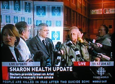
However, it all really starts to fall apart up top:
![]() Where it looks like everything left over is just tossed on, taking up valuable screen space.
Where it looks like everything left over is just tossed on, taking up valuable screen space.
Do we really need to cycle through the current time for every zone in Canada? I would say: “No.” Sometimes it just says “cbc.ca,” telling viewers to turn off the TV and go the computer. I smell some viewer complaints coming on.
Do we really need to be told this is a “live update” that is “live?” Again, I don’t think so. I’m going to give them the benefit of the doubt, this being the first day, and hope that the practice won’t continue. But if it were up to me, I would put “live” somewhere in the big bar in the middle, and scrap the time altogether.
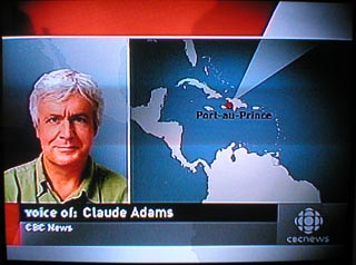
Which is exactly what they’ve done on the regular network, which looks cleaner to me:
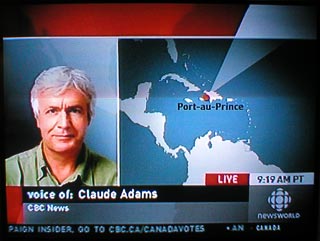
 While Newsworld‘s news (and time zone) junkies get all the value added:
 It’s not going to win any awards for originality, but overall, it’s good. Handsome and functional. Which is, I assume, why CNN uses it. While less distinctive than the old look, it’s consistent and closer to the CBC brand, as promised. It also strikes me as very web-inspired, with its economy of space ruled by the grid.
That it is good is even more commendable when you know that it was done in-house on a frugal budget in a short time. Not long ago this would have been outsourced at great expense.
As part of its debut, CBC News Editor-in-Chief Tony Burman launched an online-only, weekly column on media issues, where “responses are intended to contribute to a conversation.” Say what you want about Tony, but the boy can write and he has a lot of interesting things to say.
And now he’s a CBC blogger.

8 Comments
The New Look isn’t finished yet – they had to launch without all their doodads and animations in the end because of software overload.
So now they are in production with “Phase Two” which involves getting the software reprogrammed by Inscriber to accomodate all the planned crap.
Launch date of Feb. 6 for “Phase Two” has already been scrapped as unrealistic. Stay tuned…
Incidentally, the new look does remind me a lot of RDI. Was that intentional?
I really like it, actually. I see the similarities with CNN but I think it has a very clean, dignified sort of look to it — compared to CNN’s increasingly tabloid-y look (dare I say Maclean’sish? Or is that too many words to make up in one sentence?)
I am hoping that it will be used more consistently than the old identity. I doubt many Canadians care, but it did bother me a little bit when, for example, old graphics would be thrown up using any old font. It doesn’t matter to the content, no — but it does show a lack of attention to detail. Hopefully now that the graphics have been created in-house, it will be easier to maintain that level of consistency.
James Sherrett has some interesting things to say on the subject.
You can really see the BBC influence, especially on CBC.ca with a new ticker in the middle of the front page that is identical to that of bbcnews.com. The CBC website is horribly outdated and ugly and I expect to see a new version that strongly resembles the BBC.
As you can probably tell from my blogs and web sites – I’m not much of a graphics person. I’m more of a concepts person. So, from that perspective, this is not a huge deal to me – had it been truly garrish it would have been, but the change is small enough that it actually had to be pointed out to me before it really even registered.
I miss the disco theme. Any country whose national newscast has an upbeat disco theme is a-ok with me ;-)
I’m sorry to see the modern Trek/Okudagram-inspired look go. I liked it.